Design an email template
Use the reusable-template designer to prepare the message layout, text, images and links. Select the intended element and inspect the actual result before saving. Device previews do not establish how every received email will appear.
Create or find the intended reusable template first. After preparing a design, review the separate campaign audience, sender and release choices.
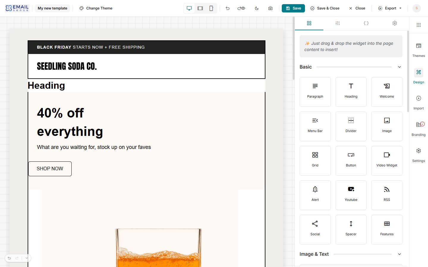
Add a heading widget
- Open the intended reusable template’s designer and find Heading in the Basic widgets palette.
- Drag it from the palette to the intended position on the canvas.
- Check that a new heading appears where you intended. Select that new element before editing its wording or styles.
- Use Undo if the last insertion was not intended, then inspect the canvas to confirm that the inserted element was removed.
- Review the content and layout before saving. To discard the current unsaved work, use Close, labelled Close without saving, and reopen the intended template to check its saved state.
Check the canvas after a history action
Read the actual canvas after Undo or Redo rather than relying only on a button appearing enabled. If the result is unexpected, stop before saving over the intended design. Keep the steps and a screenshot for support. Close without saving only when you intend to discard all current unsaved work; it does not reverse a previously saved update.
Change text fonts and colours
- Select the intended heading on the canvas and check that the sidebar says Heading. Use Unselect or Select Parent when you need a different element.
- Review Heading Type separately from its appearance. Then choose the intended Font Family, Font Weight and Font Size.
- Use Text Color for the heading wording and review Link Color separately where the text links to another page.
- Choose the intended Alignment, then check wrapping, line height and surrounding space in desktop and narrow views.
- For an overall font choice, open page Settings and confirm the sidebar says Page before reviewing Font Family. A selected element can have its own style choices; compare the actual heading rather than assuming every element changes together.
- Review readability against the background, then save and reopen the intended template when the update is ready. Check the intended received test message separately before campaign release.
For example, when a collection heading looks crowded, adjust its selected heading’s font and spacing before changing the whole page. If the expected text does not change, confirm which element and style field you edited before making several unrelated adjustments.
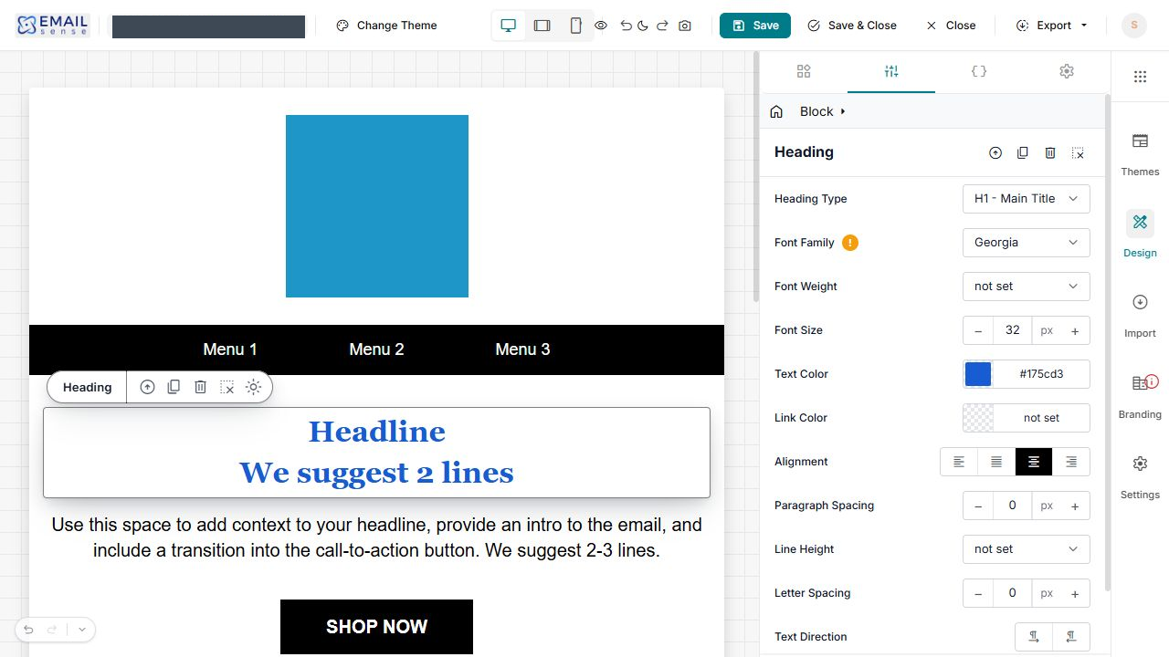
When entering a colour value, move focus out of the field and inspect the actual selected heading before saving. For example, the preview below uses Georgia at 32 px with a blue Text Color. Choose values for your own design; compare the heading with the surrounding text and background. To discard all current unsaved edits, use Close without saving, then reopen the same template and check its stored settings.
Choose the right spacing control
First select the Page, Heading or surrounding Block you intend to change. A gap in the layout can come from several settings; review one setting at a time and compare the result before saving.
| Control | Use and check |
|---|---|
| Block Gap | Review the space between blocks. Use this when the separation between whole sections needs attention. |
| Page Padding | Review the top, left, right and bottom space around the overall content. Check the narrow mobile view as well as desktop. |
| Block Padding | Review the four sides inside a content block. Keep it separate from the gap between blocks. |
| Padding guides | Keep the page or block padding guides visible on the canvas while checking spacing. A guide is an editing aid, not proof of the received email’s layout. |
| Paragraph Spacing | Review separation around the selected text. Do not use repeated blank lines as your only layout control. |
| Line Height | Review spacing between lines in the selected heading or text. Check wrapping after changing the text or width. |
| Letter Spacing | Review the distance between letters. Check the complete heading, especially on a narrow screen. |
| Text Direction | Choose the direction appropriate to the selected content: ltr or rtl. This is separate from left, centre, right or justified Alignment. |
Example: a heading feels too crowded
- Select the heading and confirm that the sidebar says Heading.
- Check its Font Size, Line Height and Letter Spacing.
- If the crowding is around the whole section, use Select Parent or Select this Block to inspect the block instead of repeatedly changing the heading.
- Compare the desktop and mobile layouts, then save the intended change and reopen it to check the result.
Browse for a template image
- Select the intended image in the reusable-template canvas and confirm that the sidebar says Image.
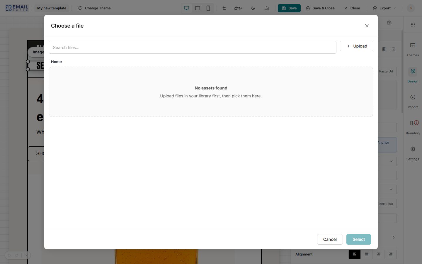
- With Browse Media selected, choose Browse to open Choose a file.
- Use Search files and the folder breadcrumb to locate an image already available in this library. Check its identity before using it.
- If you intend to add a new file, the picker offers Upload. Review the file and the upload’s actual result before trying to select it. Keep your original image separately.
- When the intended file is available, review the selection and use Select. Then check the image, Alternate Text, link and dimensions on the canvas before saving the intended template change.
- Use Cancel to leave the picker without choosing a file. Closing this picker and saving the template are separate actions.
If the image library is empty
Check the account, search text and folder before uploading duplicates. An existing template can contain an image while the picker shows no library assets. Cancel and inspect the image already on the canvas; do not remove it merely because it is absent from this view. If an intended upload does not become available, keep the filename and displayed result for support rather than repeatedly uploading it.
Check image size and destination separately
| Image control | Use and check |
|---|---|
| Width and Height | Review both the value and its unit. The panel offers pixel and percentage sizing. Preserve the photograph’s proportions and check whether a fixed dimension causes awkward stretching or wrapping. |
| Max Width and Max Height | Review upper size limits separately from the requested Width and Height. Check the resulting image on the intended device layouts. |
| Min Width and Min Height | Review lower size limits. An image that cannot shrink enough can make a narrow layout difficult to read. |
| Type and URL | Choose Web URL, Email, Phone or Anchor (in this email) for the intended destination. Then review the corresponding destination value; the right photograph with the wrong link still sends readers to the wrong place. |
| Open | Review Same tab or New tab. Check actual link behaviour in a controlled received message; mail programs handle opening links differently. |
| Title (tooltip) | Use only when a useful additional title is intended. It does not replace visible link wording or Alternate Text. |
| Screen-reader label (aria-label) | Review the intended accessible label where needed. Keep the image’s Alternate Text and the purpose of its link clear as well. |
Review image borders
- Select the intended image and open Borders.
- Use Mode to review All sides or Split controls, then check the intended side before adjusting its appearance.
- Review the Preset, Border style, width and colour together. Available styles include Solid, Dashed, Dotted, Double and None.
- Review Radius separately from border width. Check the actual received design rather than assuming every email program renders decorative styling identically.
- Use Reset borders only when you intend to reset that image’s border settings; compare the result before saving.
For a product announcement, keep photographs and links readable before adding decorative effects. After an intended image or style change, reopen the saved template and inspect the campaign that will actually use it.
Choose a readable background
- Open the intended template and select the Page settings. Confirm that you are inspecting the overall page rather than one image or heading.
- Review Default Block Background and the background Color separately. Note the existing colour values before changing them; check both the area behind the content and the individual sections.
- For a background image, the background panel offers Browse and Paste URL. Check the intended file or image address, then inspect the resulting background before keeping the change. Background images and content images are separate design choices.
- Use the background image’s Remove action only when you intend to remove that background image. Check the remaining colour and text contrast afterwards. A disabled Remove control can accompany a background with no image.
- Review Gradient only when a graduated background is intended. Check every area behind the text, not just the first colour you see.
- Compare desktop and mobile views. Keep headings, offer conditions and buttons readable without depending on a decorative background image.
- Before releasing a campaign, check a controlled received message in the email programs your audience uses. A designer preview alone does not establish how a background will appear there.
Understand the effects controls
Check which Page, Block or Image is selected before adjusting an effect. Start with one change, compare the result, and retain the previous value so you can restore it deliberately. The background panel and selected-image panel have their own controls.
| Control | What to review |
|---|---|
| Opacity | Transparency, shown as a percentage. Check whether the background or surrounding content makes the selected area harder to see. |
| Blend | The background panel offers Normal and other blend modes. Compare the selected mode against the underlying colours and image; check the whole readable area rather than relying on the mode’s name. |
| Blur | Softening, shown in pixels. Keep logos, product details and any wording inside an image clear enough to recognise. |
| Brightness | How light or dark the treatment appears. Review highlights and darker product details together. |
| Contrast | The difference between lighter and darker areas. Check that detail is still visible and text remains readable. |
| Saturation | Colour intensity. Compare against the original photograph so that a decorative treatment does not misrepresent a product’s colour. |
| Grayscale | The amount of a greyscale treatment. Check whether colour carries useful information in the photograph or promotion. |
| Sepia | An image colour treatment. Use it deliberately and compare the result with the original product photograph. |
| Invert | An inverted image treatment. Check the full image carefully, especially logos and product colours. |
| Hue Rotate | An image colour rotation, shown in degrees. Check the resulting colours against what the message is meant to represent. |
The background panel includes Reset effects and a separate Reset all. Check the selected panel and your intended scope before using either. Do not assume Reset all is limited to the last effect or that it restores a previously saved template. Compare the resulting settings and canvas before saving.
Example: a product photograph looks washed out
- Select the photograph and confirm that the sidebar says Image.
- Compare the photograph with your original image. Review Opacity, Brightness, Contrast and Saturation one at a time.
- Check whether Grayscale, Sepia, Invert or Hue Rotate is contributing to an unintended colour treatment.
- Inspect the surrounding background as well. If the problem affects a whole section, select its parent rather than repeatedly changing the photograph.
- Keep the intended appearance only after checking the layout and a controlled received message. If the result is unexpected, stop before saving over the design and retain the steps and a screenshot for support.
If the received email looks different
Compare the same campaign and template, the affected section, and the email program used to view it. Keep a copy of the original image and note the selected background or image effects. Simplify the design where needed so that the message, product information and links remain useful without decorative styling. Do not repeatedly change several effects at once: that makes it difficult to identify which change helped.
Choose a widget for the message
Plan the reading order before adding elements. The palette separates Basic widgets, Image & Text layouts and Text layouts. Use the simplest arrangement that makes the message and next action clear.
| Widget or layout | Suggested use and checks |
|---|---|
| Paragraph | Use for the introduction, product explanation or offer conditions. Keep the message readable without relying on wording inside an image. |
| Divider | Use a visual separation between sections. Check that nearby content still has useful spacing and that the divider does not look like an extra button. |
| Image | Use for a logo or product photograph. Select the intended image element, check its file, Alternate Text, size and any link, and compare the result with the original photograph. |
| Grid | Consider it when arranging related items together. Check the actual inserted structure and reading order on desktop and mobile before filling it with several products. |
| Button | Use for a clear next action, such as “Explore the collection”. Check its wording and the intended destination rather than retaining a sample shop link. |
| Social | Consider it for links to your business’s social pages. Check every displayed service and its actual destination; remove or replace sample links deliberately. |
| Spacer | Consider it for an intentional gap between elements. Check Page and Block Padding first so that several different spacing controls do not create an excessive gap. |
| Image Left & Text / Image Right & Text | Consider a side-by-side product explanation. Check the image/text order and the actual narrow-screen layout. |
| Image Top & Text / Image Bottom & Text | Choose whether the image should introduce or follow its accompanying wording. Check that the photograph and description still clearly belong together. |
| Text Center / Text Left | Choose a starting text arrangement for the section. Check the actual alignment and line wrapping after replacing sample wording. |
Example: build a simple collection announcement
- Plan a heading, a short introduction, one product image or Image & Text layout, and one main button.
- Add and inspect one element at a time. Select the newly inserted element before replacing its sample content.
- Replace placeholder wording, images and destinations. Keep the offer conditions close to the offer they explain.
- Review desktop and mobile views. Check image proportions, reading order, spacing and button wording.
- Inspect the actual canvas after Undo or Redo. Review the intended design before saving, and check a controlled received message before release.
The palette also contains Welcome, Menu Bar, Video Widget, Alert, Youtube, RSS and Features. These are separate choices with their own content and behaviour to review. Their availability does not establish automatic personalisation, live feeds or video playback in a received email. Inspect the intended widget’s controls and resulting message before relying on it.
Review the canvas and editing history
The toolbar’s Toggle preview switches the canvas view. Compare the visible result and use it again to return to the view you were using. This is separate from a controlled test email and does not prove how the message will render in an email program.
Open History to inspect the current editing history. An empty history can show Nothing to undo yet, with Undo, Redo and Clear disabled. Check the actual entries and canvas before using an available history action. Do not treat this panel as a backup of previously saved versions or use Clear as a way to undo a design.
Use the inline image tools
- Select the intended image on the canvas and confirm that the sidebar says Image.
- Choose Link, Effects, Resize or Crop on the image toolbar to inspect that tool’s popover.
- Review the selected image and the values before making an intended change. These tools are separate from selecting a different file.
- Use Cancel when you intend to leave the popover without keeping its changes. Use Done only when the intended values are ready, then inspect the actual canvas and sidebar.
- Review the full template before saving. Check the saved design and a controlled received email before relying on the result.
| Tool | What to inspect |
|---|---|
| Link | Review Type, URL, Open, Title and Screen-reader label. A correct photograph with an unintended destination can still take a reader to the wrong place. |
| Effects | Review the image’s colour, clarity and opacity controls. Compare one intended change at a time with the original photograph. |
| Resize | Review Width, Height, their units and Lock aspect ratio. Check the intended proportions and actual layout rather than relying only on one dimension. |
| Crop | Review Crop & Focus for the selected image. Decide whether a crop is actually needed, keep the original image and check the important subject remains visible. Review the actual result in a received message rather than assuming every email program displays it identically. |
The image also exposes corner resize handles. If using a handle, work on the intended image, make a deliberate adjustment and inspect Width, Height, units and proportions afterwards. Check both desktop and narrow layouts before saving. Resizing the display and replacing the source photograph are different tasks.
Review advanced image-link fields
Expand Advanced within the selected image’s link settings when you need those additional options. The panel has relationship choices labelled nofollow, sponsored, ugc, bookmark and author, plus Download filename. Keep existing values unless you have a clear reason to change them; review unfamiliar relationship or download behaviour with the person responsible for the linked content.
The panel also has these campaign-tag fields. Use a consistent naming plan and inspect the resulting destination before keeping the link.
| Field | Example to review |
|---|---|
| utm_source | newsletter |
| utm_medium | |
| utm_campaign | spring_collection |
| utm_term | Use only when your tracking plan calls for a term value. |
| utm_content | collection_image, to distinguish this image link in your naming plan. |
Check existing campaign tracking choices as well as the individual link fields. Do not assume entering tags proves that the destination, tracking service or a received email records the intended result.
If an image tool does not give the expected result
Check which image is selected and whether you are inspecting the sidebar or an inline popover. Compare its values with your original image and intended link. If a file-selection view does not appear after an intended Replace or Upload action, keep the current image, note the exact action and browser result, and ask support before repeatedly trying to upload. Do not remove the image to work around an unconfirmed file-selection problem.
For an unexpected unsaved edit, inspect the actual canvas after Undo. Use Close without saving only when you intend to discard current unsaved work; then reopen the intended design to check its saved state. That does not undo an update that was already saved.
Add a Welcome message block
- Open the intended reusable template and find Welcome in the Basic widget palette.
- Drag it onto the intended position in the email canvas. Check the actual position and surrounding content after dropping it.
- The inserted example contains a Welcome! heading and a message paragraph. Select each text element you intend to edit, replace the sample wording and review its formatting.
- Use Select Parent when you intend to work with the surrounding Block rather than just its heading. Confirm the sidebar title before changing background, borders or padding.
- Check the complete email, links and narrow layout before saving your intended design.
For example, use a short welcome heading followed by what the reader can expect from your shop. Inserting a Welcome layout does not set up a welcome-email automation or select recipients; prepare those separate tasks deliberately.
After an unintended edit, check what actually remains on the canvas after Undo. If you need to discard unsaved work, leave without saving and reopen the intended saved template to check it. This does not restore a version you have already overwritten.
Check editor appearance separately from the email
The toolbar has a dark/light appearance control. Read its current tooltip to see which mode it will switch to. Review the email itself in its desktop and narrow views as well; the editor’s appearance is not proof of how a recipient’s email application will display your message.
Add navigation links with Menu Bar
Use a short menu when an email needs a few clear destinations, such as your new collection, shop information and contact page. Keep the main call to action easy to find.
- Drag Menu Bar from the Basic widgets onto the intended position in your email canvas.
- Select a menu item and check that the sidebar says Menu. The inserted example includes Home, About and Contact links; replace sample destinations before using the design.
- In List Items, expand the intended item with Edit. Check its Label and URL. A placeholder URL such as # is not your shop’s page address.
- Use Add or an Insert here position when you need another item. Use its reorder handle to arrange items, and check the resulting order. Use the item’s Delete action only for the intended item, rather than the whole menu’s Remove action.
- Choose Orientation: horizontal for a row or vertical for a stack. Vertical orientation exposes Item alignment; this is separate from the overall Block alignment.
- Review Items Gap and Separator, then font family, weight, size and Text Color. Check that labels remain readable and fit the available width.
- Review every label and destination, including desktop and narrow layouts, before saving. Check the links in an authorised received test message before releasing the campaign.
Menu settings to check
| Setting | What to review |
|---|---|
| List Items | Each label, URL and position. For example, “New collection” should lead to the intended collection page, not a placeholder or an old promotion. |
| Block alignment | Placement of the menu as a whole. |
| Orientation and Item alignment | Row versus stack, then alignment of items where the vertical controls are available. |
| Items Gap | Space between links. Check longer labels and narrow layouts. |
| Separator | No separator, a supplied divider or Custom. Review the available custom field and actual result before relying on a custom character. |
| Typography and Text Color | Readable size, contrast and font choices alongside the rest of the email. Confirm the result in the email applications you support. |
If a menu does not look or link as intended
- Item alignment is absent: check Orientation; the item-alignment choices appear for a vertical stack.
- A link goes nowhere useful: expand that item and inspect its URL for #, an incomplete address or an old destination.
- Labels wrap awkwardly: shorten them and review orientation, gap, font size and narrow layout together.
- The wrong settings appear: check whether you selected the menu, one of its items or its parent Block before changing anything.
Review a direct-video block
Use Video Widget only when you have the intended direct video-file address and a plan for readers who cannot play it in their email application. For example, a product demonstration should also have a clear route to its viewing page.
- Drag Video Widget from the Basic palette into the intended position on the email canvas. Check that the actual block appears before continuing.
- Select the inserted block and confirm that the sidebar says Video.
- Review Video URL. The control asks for a direct .mp4, .webm or .ogg file URL. A YouTube or Vimeo viewing-page address is a different kind of destination; do not paste it here expecting the same behaviour.
- Review Width, Height, their units and Alignment. Check the proportions and available width in both desktop and narrow layouts.
- If needed, review the block’s border settings using the field reference below.
- Check the actual loaded result, the alternative viewing link and an authorised received test message before saving and releasing the intended campaign.
A visible placeholder or a player in the editor does not establish playback in a received message. Keep a useful text link or linked image to the intended viewing page so readers have another way to reach the content.
Direct-video field reference
| Control | What to review |
|---|---|
| Video URL | The intended direct video-file address, its access requirements and the actual loaded result. |
| Width and Height | The value and unit for each dimension, proportions and available layout width. |
| Alignment | Left, centre or right placement within the available area. |
| Border Mode | All versus Split controls. Inspect the side controls actually presented before changing individual edges. |
| Border presets and style | None, Thin, Medium or Thick presets, then the intended Solid, Dashed, Dotted, Double or None style. |
| Border width, colour and Radius | The outline and corners, checked against the surrounding layout and received message. |
| Reset borders | Use only when you intend to replace the current border choices; inspect the result before saving. |
If the media block is missing or does not play
- No block after dragging: check that the full widget card and intended drop area are visible. Inspect the actual canvas and stop if insertion still fails; keep the template name, widget and browser details for support.
- No video yet: select the Video block and inspect the intended direct-file URL. Do not repeatedly save an empty placeholder as a repair.
- A hosting-page link does not work as a video file: use the appropriate supported content route or a clear linked image/text destination; ask support if unsure.
- Editor preview works but the received email differs: retain the received example and email-application details, and check the alternative viewing link. Do not promise identical embedded playback to all recipients.
Build a feature list in an email
Use Features to present a small set of related points with icons, titles and descriptions. For example, a product email might group Material, Care and Size information. Supply accurate details for your products and replace every sample claim before using the design.
- Drag Features from the Basic palette onto the intended canvas position.
- Select an inserted feature and confirm that the sidebar says Feature list.
- In Features, use the intended item’s Edit control. Review its Icon, Color, Title and Description.
- Replace the sample title and description with your own wording, then check that the correct item changed on the canvas. Open the icon picker to review its choices, including None; choose an icon that supports the wording rather than replacing an essential explanation.
- Use Add feature for another item. Replace the new item’s sample content before keeping it. Use Move up, Move down or the reorder handle for the intended order, checking the actual result.
- To remove an item, use that row’s Delete feature action. This is different from removing the whole selected Feature list.
- Review Columns, colours, sizes and Outer padding, then check desktop and narrow layouts before saving the intended design.
Feature list settings
| Control | What to check |
|---|---|
| Columns | Choose from the displayed one-to-four-column choices. Check the actual reading order, wrapping and narrow layout. |
| Item Icon and Color | Review the particular item’s symbol and colour in its Edit area. None is an available symbol choice. |
| Icon color and Icon size | List-level appearance controls. Compare these with any per-item colour choice rather than assuming which value takes precedence. |
| Title color and Title size | Readable headings with consistent emphasis. |
| Description color and Description size | Supporting wording that stays legible alongside the heading. |
| Outer padding | Top, Left, Right and Bottom space around the feature list. Review surrounding Block/Page spacing as well. |
If a feature list looks wrong
- The wrong item changed: check which row is expanded before editing its Title or Description.
- Order is wrong: compare the list rows with the actual canvas after each move, especially before deleting a row.
- A column is crowded: shorten wording and review column count, sizes, padding and narrow layout together.
- Colour is unexpected: inspect both the item’s Color and the list-level controls, then compare the result.
- Unfamiliar claims remain: replace all supplied promotional statements with wording you can support for your own shop. A starter design’s delivery, security or reliability claims are not your business’s promises.
Clear an image or remove its element
First decide whether you intend to clear the selected photograph or remove its whole image element. These are different controls.
- Select the intended image on the canvas and confirm that the sidebar says Image.
- To clear its current source, use the Remove beside the file preview in the image-source area. Inspect the result: a placeholder can remain in the image element, and its size can affect the surrounding layout.
- Check Alternate Text separately. Clearing the source can retain the old wording, so do not leave a replacement or placeholder with an unrelated description.
- If you intend to remove the whole selected image element, use the element’s Remove action in its selection controls. Check that the intended element disappeared and review the space around the remaining content.
- Inspect desktop and narrow layouts before saving the intended change. Removing an element from this design does not establish that its original uploaded file was deleted from the media library.
Do not clear or remove an image merely to work around a file-picker problem. If your task is replacement, retain the original source and use the intended replacement workflow; stop and ask support if the chooser does not open.
Reset background effects carefully
- Select the intended Page or Block and confirm the sidebar title. Check that you are in its Background settings, rather than the selected image’s effects.
- Review the current colour, image, gradient and effect values before using a reset. Keep the intended appearance available for comparison.
- Use Reset effects when the intended task concerns effects. Inspect the actual Opacity, Blend, Blur, Brightness, Contrast, Saturation and Grayscale values afterwards.
- Treat Reset all as an action in that background panel, not as recovery of the entire saved design. Check each value afterwards, including Color and any image or gradient.
- Review Page/Block Padding separately and inspect the actual canvas before saving.
Do not assume a reset restores the original colour or padding. A background reset can return effect values while leaving those other choices in place. If the intended task is to discard all current unsaved edits, leave without saving and reopen the saved design, then check its actual values. That does not reverse an update already saved.
If a reset or removal was unexpected
Stop before saving. Check the selected element, the precise Remove/reset control used and the actual canvas. After clearing an image, compare its placeholder and Alternate Text; after a background reset, inspect colour, effects and spacing individually. Check the actual result after any Undo action before relying on it. For support, retain the design name, selected element and action, without sharing private content unnecessarily.
If the selected element is wrong
Use Unselect to clear the selection or Select Parent to inspect its surrounding block. Read whether the sidebar says Page, Heading or Image before changing shared styles. Copy and Remove are element actions; check the intended element and the resulting layout before saving.
Upload a replacement image from your computer
- Keep the original image file and open the intended reusable template.
- Select the image you intend to replace. Check that the sidebar says Image.
- Use Upload in the selected image's inline toolbar. In the file chooser, select your intended image.
- Check the actual replacement on the canvas and the dimensions shown in the Image panel. An upload can retain the selected element's display size, so inspect its proportions and layout separately from the source dimensions.
- Enter useful Alternate Text, move focus out of the field, and review the image's link and dimensions.
- Choose Save and wait for Data saved successfully. Leave and reopen the same template to check the replacement before using the design in a campaign.
For example, replace a starter design's logo with your own prepared logo, then check that its size and any linked destination suit your shop. Replacing the picture does not replace the starter design's other wording, menu links or offer details.
If an uploaded image does not appear as expected
Check the selected image element, chosen file and actual canvas before uploading again. A small source image can appear enlarged by the element's retained width. Review Width and Height rather than repeatedly uploading the same file. If a setting appears to change only in its input, leave the field and inspect the selected element before saving; reopen the saved design to confirm the result.
Add an RSS feed block
Use RSS when you intend to include items from an RSS feed, such as recent posts from your own shop's blog. Check that you have the intended feed address and permission to use its content; a normal website page address is not necessarily an RSS feed.
- Drag RSS from Basic widgets into the intended canvas position.
- Select the inserted block and confirm that the sidebar says RSS. Before a feed is supplied, its placeholder asks for an RSS URL.
- Review the RSS FEED address and separate Fetch action. When loading your intended feed, inspect the actual returned items, dates, pictures and links before relying on the result.
- Review Style: Classic (List) or Modern (Cards).
- Choose the information you intend to show: Title, Description, Date, Image, Read More Link and Author.
- Review Max Items and Content Length, then inspect the actual amount of content and wrapping. Review the block's background and borders separately.
- Save and reopen the intended design when ready. Check the actual campaign content and a controlled received example before release; do not assume a reusable template automatically refreshes its feed at sending time.
For example, a short recent-posts section may need only a few items with clear titles and links. Check that old posts, long descriptions or missing images do not dominate the rest of the message.
If an RSS block is empty
A placeholder asking for an RSS URL is not loaded feed content. Check the intended feed address and the actual result of Fetch. Record any displayed error before trying another address. Do not repeatedly save or send a placeholder as a way to refresh it. Check feed access, content and links separately from the template's layout.
Add an Alert message
Use Alert for a short highlighted message, such as a change to collection times. Keep essential information in the wording, rather than relying on its colour alone.
- Drag Alert from Basic widgets into the intended position. The new block contains sample wording; replace it with the message intended for your customers.
- Select the block and confirm that the sidebar says Alert.
- Review Font Family, Font Weight, Font Size, Text Color and Link Color. Check Text alignment, Paragraph Spacing, Line Height, Letter Spacing and Text Direction where needed.
- Review Background Settings and Borders for the intended contrast and outline.
- Use Alert Padding for the space inside the message: Top, Left, Right and Bottom. Review the surrounding block spacing separately.
- Check the full wording, any links and narrow layout before saving. Inspect an intended received example before campaign release.
If the message is hard to read, compare text and background colours, font size and padding together. If the wrong settings appear, check the selected element before changing its parent block. Remove sample wording such as “This is an alert!” before using the design.
Add a YouTube link block
- Drag Youtube from Basic widgets into the intended canvas position.
- Select the inserted placeholder and confirm that the sidebar says YouTube.
- Review Youtube URL. The field accepts YouTube watch, embed, shorts or youtu.be addresses; a direct video-file address belongs in Video Widget instead.
- Review the Email mode. The editor describes the email result as a clickable thumbnail that opens YouTube; its Web-player mode is unavailable in this email-template editor.
- After supplying the intended video address, inspect the actual thumbnail and destination. Review available Thumbnail size choices; the panel notes that Maxres is not available for every video.
- Check Alignment, dimensions and borders where presented, then review desktop and narrow layouts before saving.
- Inspect the link and destination in a controlled received example before releasing a campaign. Keep useful accompanying text so readers know what the video shows.
For example, introduce a bag-care demonstration with a clear title and short explanation beside the linked thumbnail. Do not describe it as video playback inside the recipient's email.
If a YouTube block has no video
No YouTube video yet means the block is still a placeholder. Check the intended URL and actual thumbnail result before saving it into a finished message. A disabled Web tab in this email-template editor does not mean you should switch editors or repeatedly paste the address to force inline playback. If the thumbnail or destination is wrong, retain the template name, intended video address and displayed result for support.
